

Typography
Typography sets the fonts and text sizes used across your store. Headings and body text each have their own font, size scale and mobile scale.
1. Open the Typography settings:
2. Settings
Headings
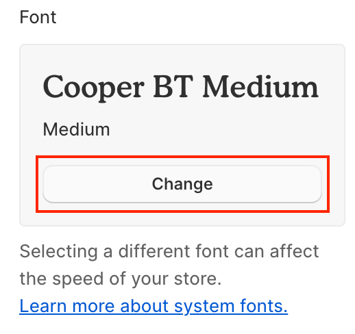
Font: The font used for headings. Click Change to open the font picker.
Font size scale: Makes all headings larger or smaller, 50–200%. The default is 100%.
Mobile scale: Adjusts heading size on mobile, 50–150%. It's applied on top of Font size scale, so a 130% Font size scale with an 80% Mobile scale gives headings at 104% on mobile. It also applies to the Heading size set in most sections. The default is 100%.
Body
Font: The font used for body text, such as descriptions, prices and menus. Click Change to open the font picker.
Font size scale: Makes body text larger or smaller, 50–200%. The default is 100%.
Mobile scale: Adjusts body text size on mobile, 50–150%. It's applied on top of Font size scale. The default is 100%.
Mobile settings apply to screens narrower than 750px.
3. Choose a font
For Headings or Body, click Change to open the font picker.
Explore the fonts with the search field, or scroll through the list.
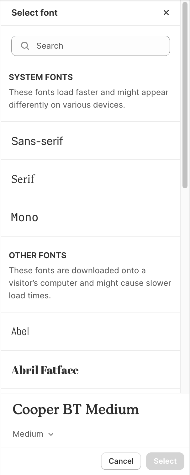
Click the font you want to use, and then click Select.
Click Save.
4. Tips
Need a font that isn't in Shopify's font library? Upload your own with Custom fonts. Custom fonts is a Pro feature.
If headings look too large on phones, lower the heading Mobile scale instead of the desktop Font size scale. Your desktop layout stays the same.
Preview on mobile in the theme editor after changing a Mobile scale, since it only affects small screens.
Last updated