> For the complete documentation index, see [llms.txt](https://help.inspiredtheme.com/articles/llms.txt). Markdown versions of documentation pages are available by appending `.md` to page URLs; this page is available as [Markdown](https://help.inspiredtheme.com/articles/collection-pages/product-grid.md).
# Product grid
Set how products are laid out on your collection pages: products per page, columns, product card style, swatches, and filtering and sorting.
***
The **Product grid** section shows a collection's products in a grid on your collection pages. You can choose how many products and columns to show, style the product cards, and let shoppers filter and sort products.
### 1. Open the Product grid settings
{% hint style="info" %}
**Steps:**
* In the theme editor, open a collection page using the page selector at the top.
* Click the **Product grid** section in the sidebar.
* Change the settings below.
* Click **Save.**
{% endhint %}
### 2. Section settings
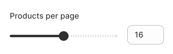
* **Products per page:** 8–24, in steps of 4. When a collection has more products, page numbers appear below the grid.
* **Number of columns on desktop:** 2–4.
* **Number of columns on mobile:** 1 column / 2 columns.
* **Product card**
* **Font size scale:** The size of the product titles, 100–200%. 100% is the default size.
* **Content alignment:** Left / Center.
* **Image ratio:** Adapt to image / Portrait / Square / Arch. **Adapt to image** keeps each image's original shape. **Portrait** and **Square** crop all images to the same shape. **Arch** crops images to a square with a rounded, arch-shaped top.
* **Show second image on hover:** Shows the product's second image when shoppers hover over the card.
* **Add image padding:** Adds space around the product image.
* **Show image border:** Adds a thin border around the product image.
* **Show vendor:** Shows the product's vendor.
* **Show product rating:** Shows the star rating. Requires a product review app.
* **Enable quick add button:** Adds a button to each card so shoppers can add to cart without leaving the page. Products with one variant show **Add to cart**, which adds the product straight away. Products with several variants show **Choose options**, which opens a quick view panel to pick options. The button is hidden on sold-out, pre-order and gift card products.
* **Product swatches**
* **Show swatches:** Shows color or variant swatches on the product cards. Choose how they look in your theme's **Swatches** settings. See [Swatches](https://help.inspiredtheme.com/articles/theme-settings/inspiredtheme-settings-intro/swatches.md).
* **Filtering and sorting**
* **Enable filtering:** Lets shoppers filter products, for example by availability or price. Use the **Customize filters** link under the setting to manage which filters appear.
* **Filter layout:** How filters are shown on desktop. On mobile, filters always open in a drawer.
* **Inline:** Filter dropdowns in a row above the products, with **Sort by** on the right.
* **Sidebar:** Filters listed in a column to the left of the products.
* **Drawer:** A **Filter** button above the products opens a panel with all filters.
* **Enable sorting:** Adds a **Sort by** menu, so shoppers can list products by best selling, name, price or date.
**Filters with the Inline layout**
**Sort by menu**
{% hint style="success" %}
The **Quick add button** in **Inspired Theme** lets shoppers add products to the cart without leaving the collection page. For products with variants, a quick view panel opens so shoppers can choose their options first.
{% endhint %}
### 3. Tips
* Use **Sidebar** for large collections with many filters, and **Inline** or **Drawer** when you have only a few filters and want more room for products.
* Pick an **Image ratio** that suits your product photos. **Portrait** works well for fashion, **Square** for most other products.
* Turn on **Show swatches** for products that come in several colors, so shoppers see the choices before opening the product.