> For the complete documentation index, see [llms.txt](https://help.inspiredtheme.com/articles/llms.txt). Markdown versions of documentation pages are available by appending `.md` to page URLs; this page is available as [Markdown](https://help.inspiredtheme.com/articles/footer/footer-blocks.md).
# Footer blocks
***
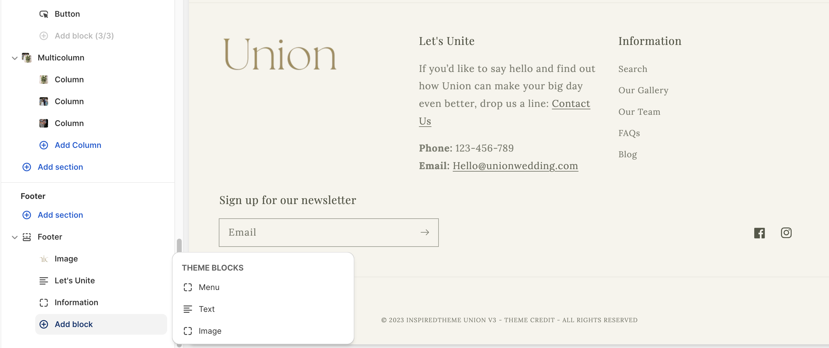
You can add three different types of **blocks** and re-arrange them in your Footer: Menu, Text, and Image.
### **1. Click the arrow beside the Footer section to reveal the ****Footer blocks****.**
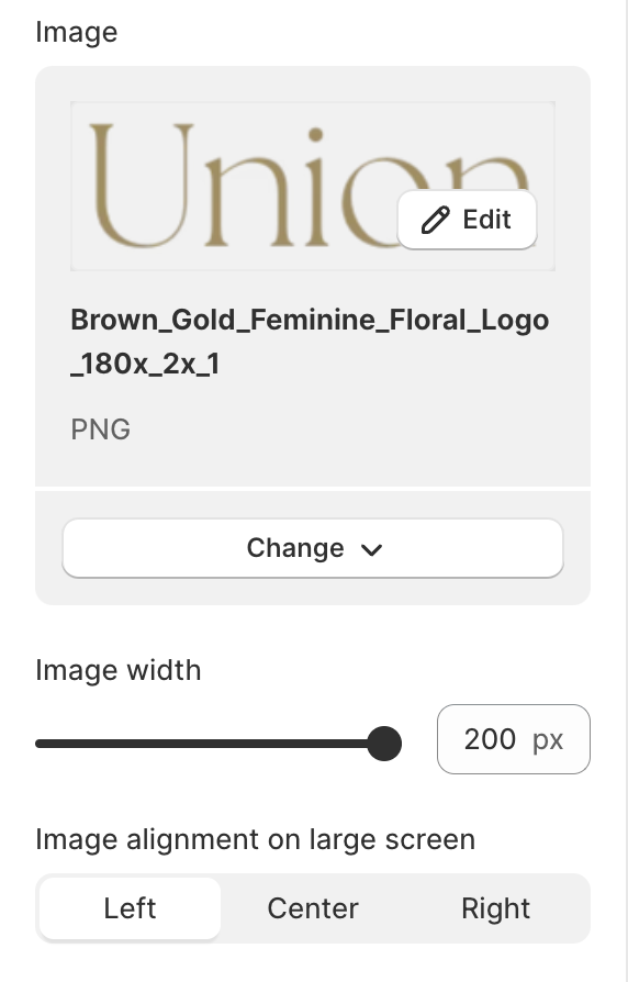
* The **Image** block is great for a logo image, or anything you like. There are no required image dimensions. Use the **Image width** slider to adjust the size of your image. (from 50px to 200px)
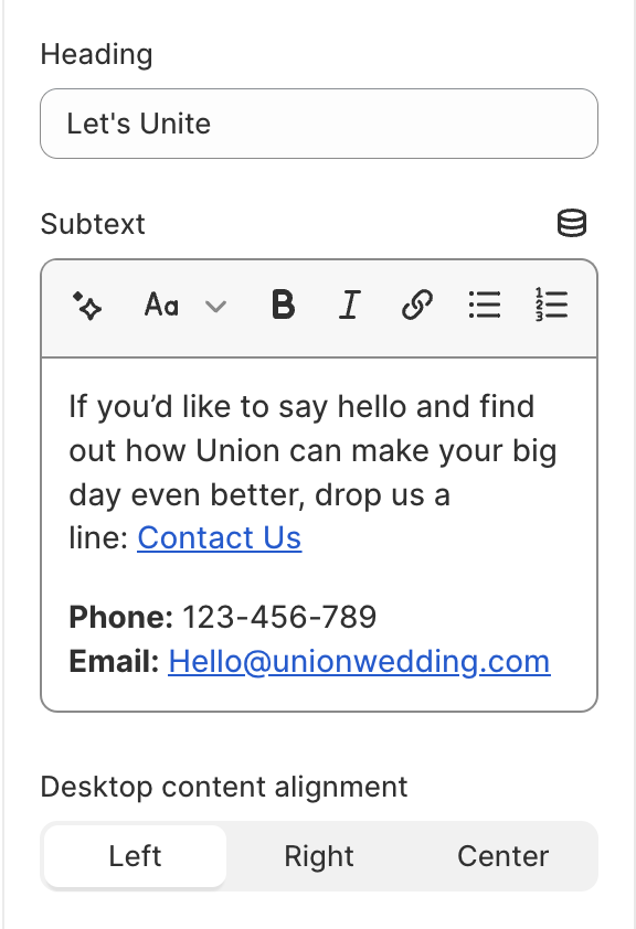
* The **Text** block can be used to highlight important information, such as store details or contact information.
You can add a brief title to the **Heading** field and a short paragraph to the **Subtext** field (use the formatting options to add bold, italic, and linked text.)
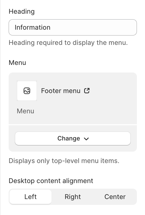
* The **Menu** block displays a column of links from one of the Shopify [navigation menus](/articles/general-information/navigation-menus.md). You can add **heading** text to display above the links. Only top-level menu items are shown in the footer, so drop-down menu types won't display as expected.
### 2. Adjust the **Desktop content alignment** of each block to create the best layout for your Footer.
* **Left** - Aligns the content to the left of the block.
* **Center (default)** - Aligns the content to the center of the block.
* **Right** - Aligns the content to the right of the block.
---
# Agent Instructions
This documentation is published with GitBook. GitBook is the documentation platform designed so that both humans and AI agents can read, navigate, and reason over technical content effectively. Learn more at gitbook.com.
## Querying This Documentation
If you need additional information that is not directly available in this page, you can query the documentation dynamically by asking a question.
Perform an HTTP GET request on the current page URL with the `ask` query parameter, and the optional `goal` query parameter:
```
GET https://help.inspiredtheme.com/articles/footer/footer-blocks.md?ask=&goal=
```
`ask` is the immediate question: it should be specific, self-contained, and written in natural language.
`goal` is optional and describes the broader end goal you are ultimately trying to accomplish on behalf of the user. GitBook uses it to tailor the answer towards what is most useful for that goal.
The response will contain a direct answer to the question and relevant excerpts and sources from the documentation.
Use this mechanism when the answer is not explicitly present in the current page, you need clarification or additional context, or you want to retrieve related documentation sections.