> For the complete documentation index, see [llms.txt](https://help.inspiredtheme.com/articles/llms.txt). Markdown versions of documentation pages are available by appending `.md` to page URLs; this page is available as [Markdown](https://help.inspiredtheme.com/articles/header/header.md).
# Header
***
The header usually contains the logo of a store, the main navigation menu, and other elements such as a search bar, shopping cart icon, etc. The header plays a vital role in branding your store, helping visitors navigate, and displaying your most important pages.
### **1. Header section settings:**
* Click the **Header** section and open the section settings.
* Use the **Color scheme** dropdown to set the color for the header section.
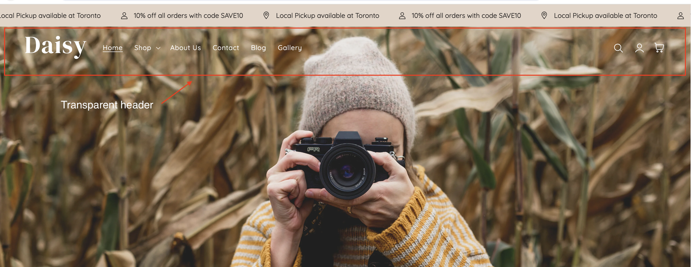
* Check the **Enable transparent header** checkbox to turn on the transparent header feature.
You can make your store's header transparent on your Home page to display your Slideshow, Video banner, or Image banner section at the top of the page.
* Select **Change icon & text color** to set your color: enter a hex color code, or choose the color from the color picker. The color will need to contrast with your slides or video to ensure visibility.
* Add a Logo image to be used specifically with the transparent header.
> ***Note**: Use an edited logo image with alternate colors to contrast with your slideshow images. For example, you may need a dark-colored version of your logo to look good on light-colored backgrounds.*
>
> *This image only displays when the header is transparent. Your main logo image will automatically display when the header is no longer transparent.*
### **2. Logo** **settings**:
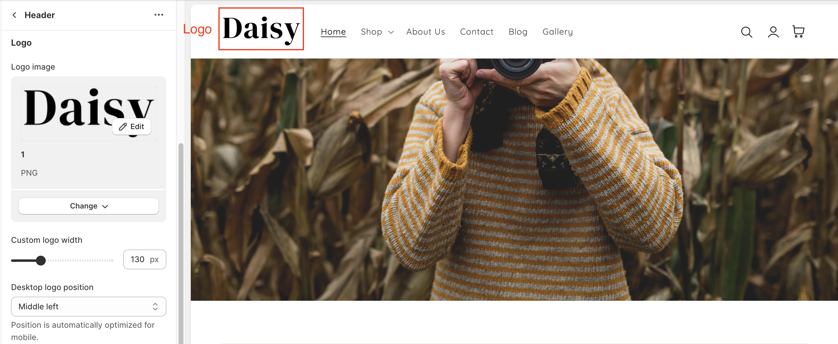
* Select or upload an image to be used as the logo in the heading. If you don't upload a logo, the name of your store appears instead. We recommend using a logo with a transparent background.
* Use the **Custom logo width** slider to change the size of the logo in the header.
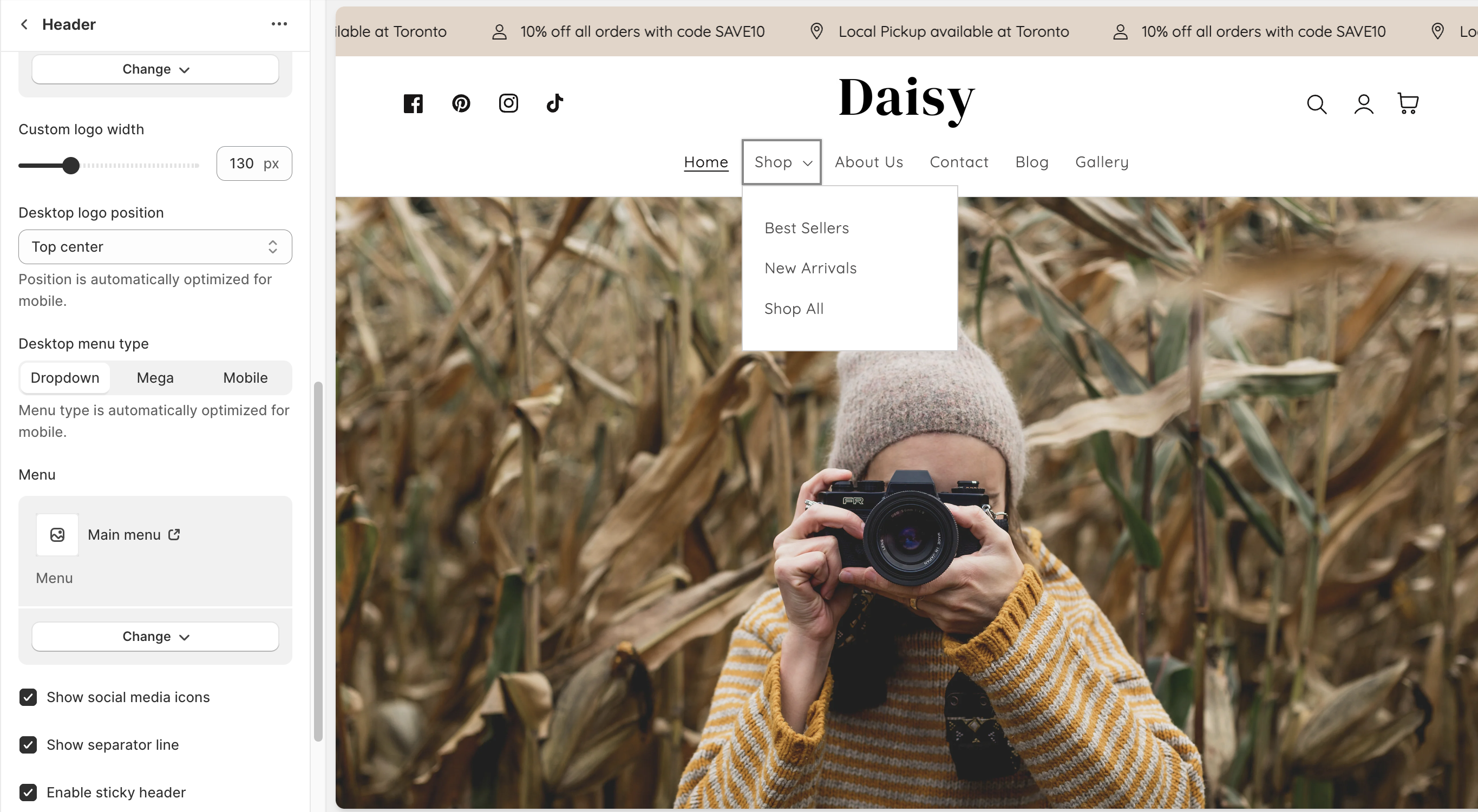
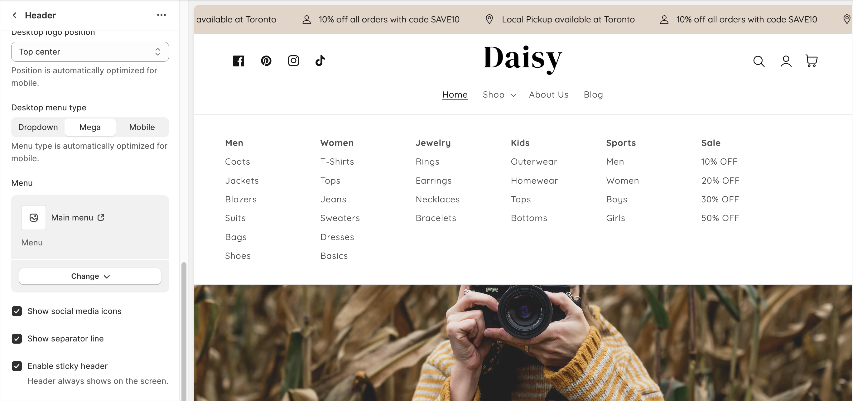
* Change the **Desktop logo position** based on your preferences.
{% tabs %}
{% tab title="Middle left" %}
This style places the brand logo to the left with the navigation in the center. The design is a more compressed header area. Ideal for smaller/shorter navigation menus.
{% endtab %}
{% tab title="Top left" %}
This style places the brand logo to the top left with the navigation menu below. Ideal for longer navigation menus.
{% endtab %}
{% tab title="Top center" %}
This style places the brand logo in the middle and the navigation menu below. Stores with many menu items can place the navigation below the brand logo and position items like account, search, and cart icons on the top right and social media icons on the top left.
{% endtab %}
{% tab title="Middle center" %}
This common option presents the brand logo centered with navigation menu items on the left. Ideal for compact headers with a shorter top-level menu structure.
{% endtab %}
{% endtabs %}
### **3. Menu settings:**
* **Desktop menu type**: This setting helps you customize the display of the header menu.
{% tabs %}
{% tab title="Dropdown" %}
You can use drop-down menus to group products, collections, or pages together and make it easier for customers to navigate your online store. This can help a customer to find the type of products that they're looking for.
{% endtab %}
{% tab title="Mega" %}
This style opens your menu links in multiple columns so customers can browse large catalogs quickly and easily.
{% endtab %}
{% tab title="Mobile" %}
This style is the cleanest option, hiding the navigation into a mobile-style drawer and keeping consistency between mobile and desktop devices.
When the menu text or icon is clicked, the slide-out mobile drawer is displayed on both desktop and mobile.
{% endtab %}
{% endtabs %}
* **Select a** **menu** to be displayed in the header.
* Check the box **Show social media icons** to show your social media (clickable icons) in your header.
* Check the box **Show separator line** to show the separator line (clickable icons) below your header.
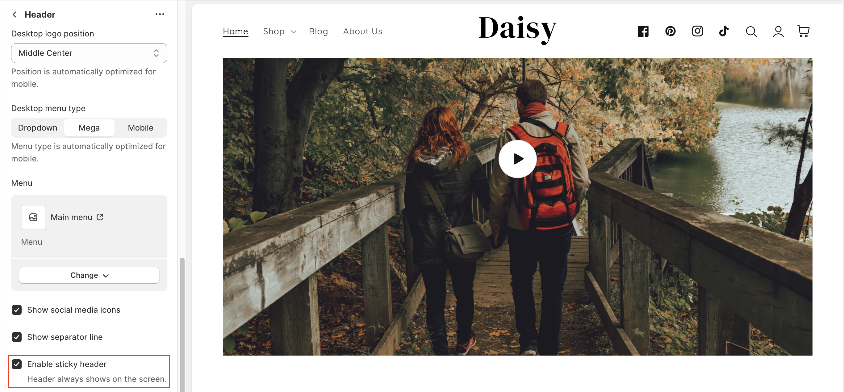
* Check the box **Enable sticky header**: Using a sticky header on your store offers several advantages that can enhance the user experience, improve navigation, and potentially increase conversions. A sticky header refers to a navigation menu or header that remains fixed at the top of the webpage even as the user scrolls down.
### 4. Mega menu block settings:
The **Mega menu block** allows you to create visually rich mega menus that highlight collections, promotions, or featured content directly within navigation.
* **Menu item:** Enter the exact name of the menu item you want to apply the mega menu to.
* **Color scheme:** Controls the background and text colors of the mega menu dropdown, based on predefined theme styles.
* **First image:**
* **Image:** Upload the image to display in the mega menu.
* **Label:** Add a heading or caption for the image.
* **Link:** Assign a clickable link to the image.
* **Second Image**
* **Image:** Upload a second image for additional visual content.
* **Label:** Add a heading or caption for the image.
* **Link:** Assign a link to the image.
---
# Agent Instructions
This documentation is published with GitBook. GitBook is the documentation platform designed so that both humans and AI agents can read, navigate, and reason over technical content effectively. Learn more at gitbook.com.
## Querying This Documentation
If you need additional information that is not directly available in this page, you can query the documentation dynamically by asking a question.
Perform an HTTP GET request on the current page URL with the `ask` query parameter:
```
GET https://help.inspiredtheme.com/articles/header/header.md?ask=
```
The question should be specific, self-contained, and written in natural language.
The response will contain a direct answer to the question and relevant excerpts and sources from the documentation.
Use this mechanism when the answer is not explicitly present in the current page, you need clarification or additional context, or you want to retrieve related documentation sections.

.png)
.png)
.png)
.png)
.png)