> For the complete documentation index, see [llms.txt](https://help.inspiredtheme.com/articles/llms.txt). Markdown versions of documentation pages are available by appending `.md` to page URLs; this page is available as [Markdown](https://help.inspiredtheme.com/articles/product-pages/product-recommendations.md).
# Product recommendations
Show automatic "You may also like" product suggestions at the bottom of your product pages, based on Shopify's product recommendations.
***
The **Product recommendations** section shows a list of related products on your product page. The products are picked automatically by Shopify's recommendations, which look at things like products in the same collections, similar descriptions and items often bought together. Recommendations improve over time as your store gets more orders and product information.
The section only appears when Shopify has recommendations for the product.
### 1. Open the Product recommendations settings
{% hint style="info" %}
**Steps:**
* In the theme editor, open a product page using the page selector at the top.
* Click the **Product recommendations** section in the sidebar.
* Change the settings below.
* Click **Save.**
{% endhint %}
The section is part of the default product template. To hide it, click the eye icon beside it in the sidebar.
### 2. Section settings
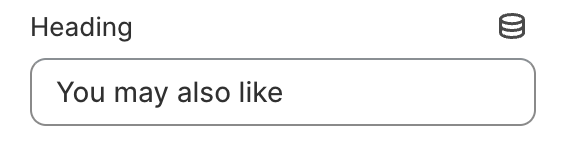
* **Heading:** The title above the products, for example "You may also like".
* **Heading size:** 15–80px.
* **Maximum products to show:** 2–12.
* **Number of columns on desktop:** 2–4.
* **Enable carousel on desktop:** Shows the products in one row that shoppers scroll sideways, instead of wrapping onto more rows. Arrows appear on hover when there are more products than columns.
* **Product cards**
* **Font size scale:** The size of the product titles, 100–200%. 100% is the default size.
* **Content alignment:** Left / Center.
* **Image ratio:** Adapt to image / Portrait / Square / Arch. **Adapt to image** keeps each image's original shape. **Arch** crops images to a square with a rounded, arch-shaped top.
* **Show second image on hover:** Shows the product's second image when shoppers hover over the card.
* **Add image padding:** Adds space around the product image.
* **Show image border:** Adds a thin border around the product image.
* **Show vendor:** Shows the product's vendor.
* **Show product rating:** Shows the star rating. Requires a product review app.
* **Enable quick add button:** Adds a button to each card so shoppers can add to cart without leaving the page. Products with one variant show **Add to cart**, which adds the product straight away. Products with several variants show **Choose options**, which opens a quick view panel to pick options. The button is hidden on sold-out, pre-order and gift card products.
* **Mobile layout**
* **Number of columns on mobile:** 1 column / 2 columns.
* **Enable swipe on mobile:** Shows the products in a row that shoppers swipe through.
### 3. Tips
* Show 4 to 8 products. Too many makes the section long and slows shoppers down.
* Turn on the carousel when **Maximum products to show** is higher than **Number of columns on desktop**, so all products stay on one row.
* Use the same **Image ratio** as your collection pages for a consistent look.