

Colors
Set your theme colors to match your brand, then apply them to each section with a color scheme.
You set your brand colors once in Theme settings > Colors. Each section then has a Color scheme setting where you choose which of these colors it uses.
1. Open the Colors settings
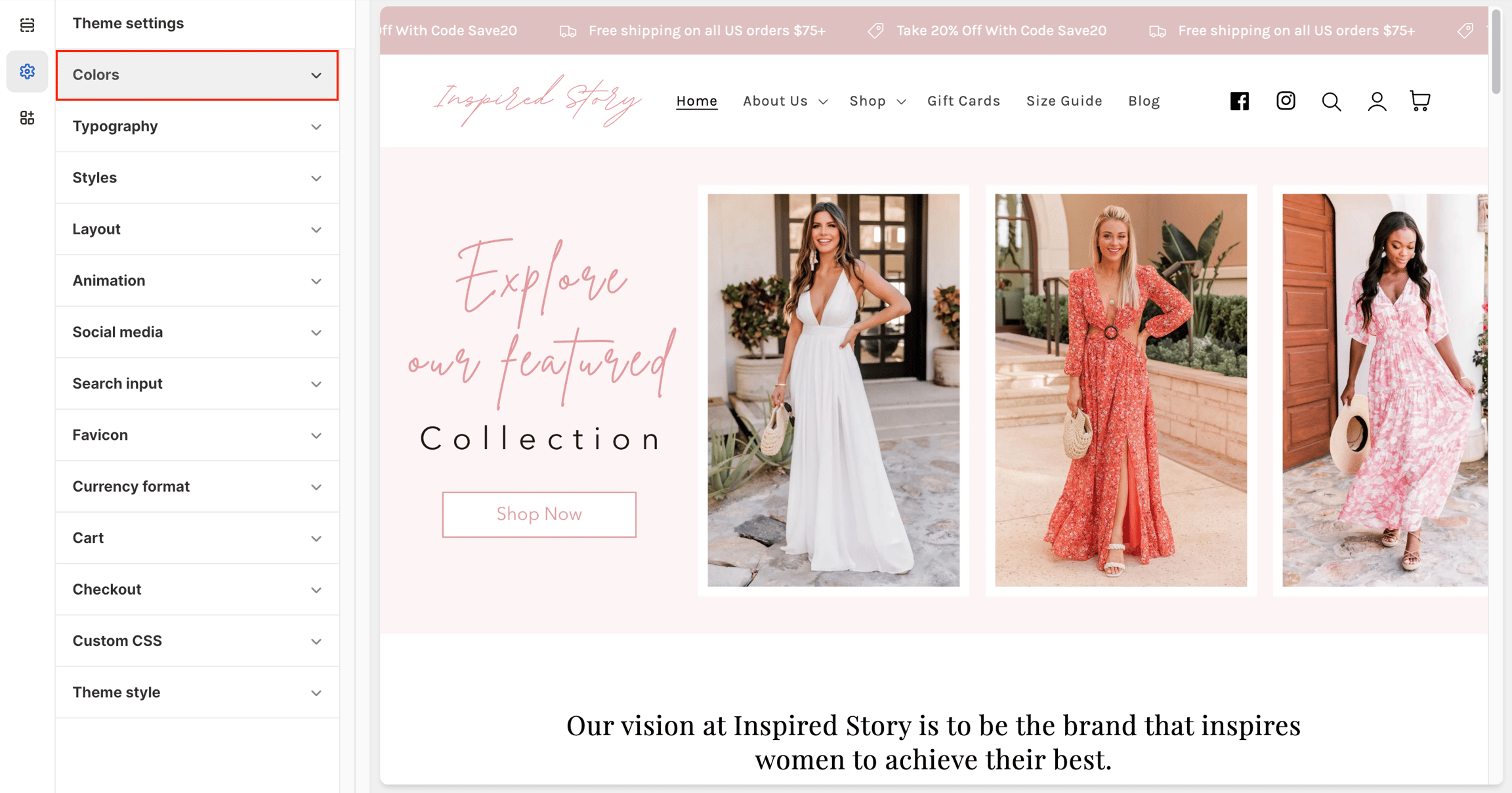
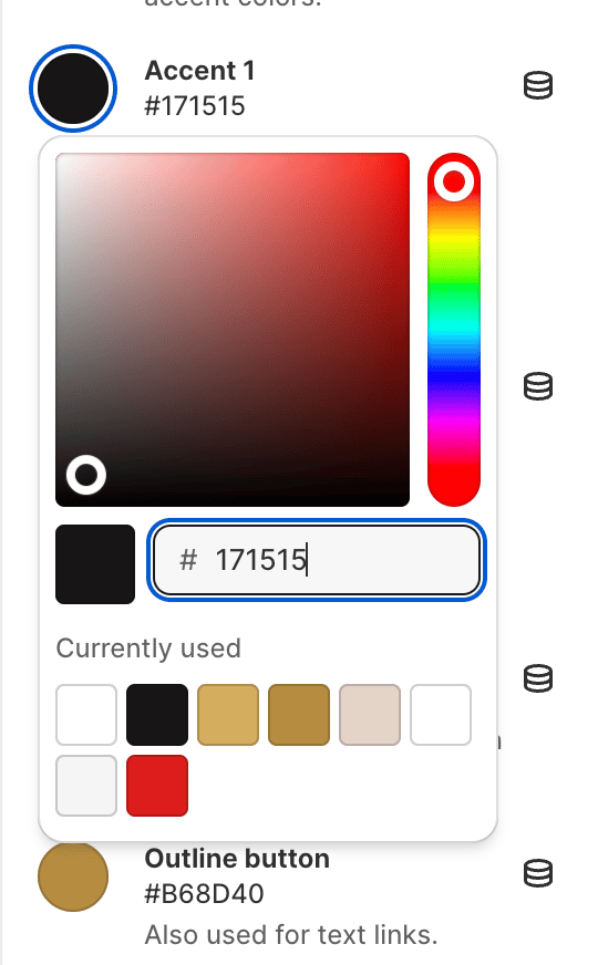
2. Color settings
Primary colors
Solid button label: The text color on solid buttons, and on sections that use an Accent color scheme.
Accent 1: The background of solid buttons, and the background of the Accent 1 color scheme.
Accent 2: The background of the Accent 2 color scheme.
Accent 3: The background of the Accent 3 color scheme.
Secondary colors
Text: The text color on the Background color schemes. It's also the background of the Inverse color scheme.
Outline button: The color of outline buttons and text links on Background 1.
Background 1: Your store's main background color. It's also the text color of the Inverse color scheme.
Background 2: The background of the Background 2 color scheme.
Background 3: The background of the Background 3 color scheme.
3. Gradients
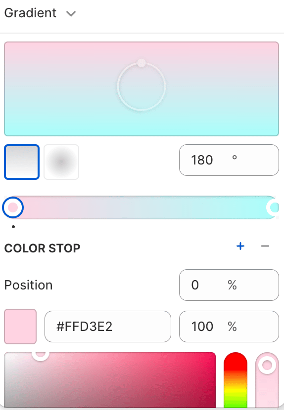
Accent 1, Accent 2, Accent 3, Background 1, Background 2 and Background 3 each have a gradient setting. When you set a gradient, sections using that color scheme show the gradient as their background instead of the solid color. Leave it empty to use the solid color.
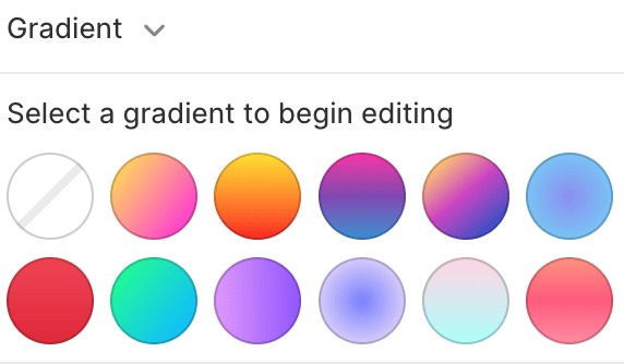
Gradients create a smooth transition between two or more colors, for a more eye-catching background.
4. The seven color schemes
Most sections offer these seven schemes in their Color scheme setting. A few settings, such as the Add to cart button color, offer only five (without Accent 3 and Background 3).
Background 1
Background 1 (or its gradient)
Text
Background 2
Background 2 (or its gradient)
Text
Background 3
Background 3 (or its gradient)
Text
Inverse
Text
Background 1
Accent 1
Accent 1 (or its gradient)
Solid button label
Accent 2
Accent 2 (or its gradient)
Solid button label
Accent 3
Accent 3 (or its gradient)
Solid button label
On Background 1, solid buttons use Accent 1 with Solid button label text, and outline buttons and links use Outline button. On every other scheme, buttons and links are drawn in that scheme's text color, so they always stand out from the background.
5. Example: change a section's background
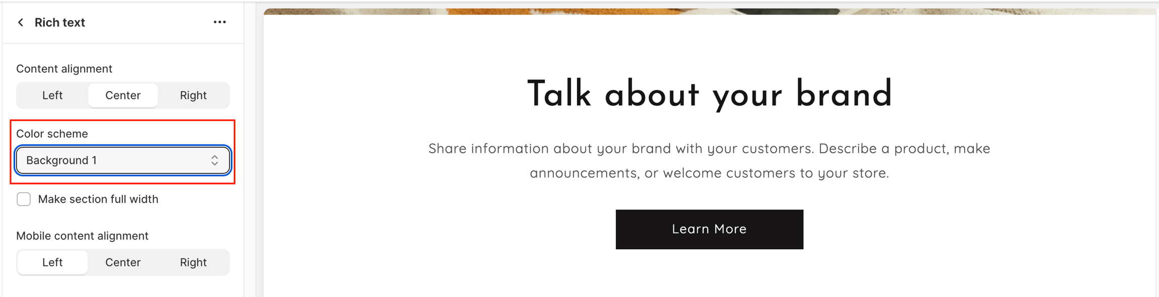
6. Tips
Choose a Text color with strong contrast against all three Background colors, and a Solid button label color with strong contrast against all three Accent colors.
Alternate Background 1 and Background 2 between sections to separate them without borders.
Badge colors are set separately in Badges.
Last updated