> For the complete documentation index, see [llms.txt](https://help.inspiredtheme.com/articles/llms.txt). Markdown versions of documentation pages are available by appending `.md` to page URLs; this page is available as [Markdown](https://help.inspiredtheme.com/articles/header/announcement-bar.md).
# Announcement bar
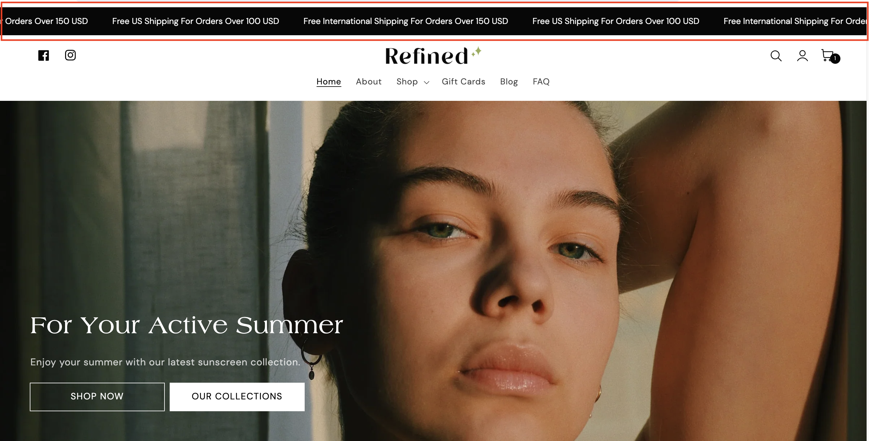
Show short messages at the very top of your store, such as shipping offers, promotions or new arrivals. Add several and they scroll across the bar.
***
The **Announcement bar** sits at the top of every page, above your header. Use it for short, useful messages:
* Shipping information, such as free shipping thresholds.
* Promotions, discount codes or new gift cards.
* New stock or collection launches.
With one announcement, the message is shown as a static bar. Add two or more and they scroll across the bar automatically.
### 1. Open the Announcement bar settings
{% hint style="info" %}
**Steps:**
* In the theme editor, find **Announcement bar** in the **Header** area of the sidebar.
* If it isn't there, click **Add section** in the **Header** area and locate **Announcement bar.**
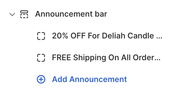
* Click the arrow beside it to see its announcement blocks, or click **Add Announcement** to add one.
* Click **Save.**
{% endhint %}
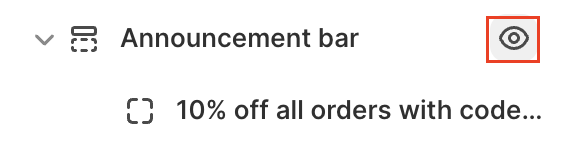
To hide the bar without deleting it, click the eye icon beside **Announcement bar** in the sidebar.
### 2. Section settings
These settings apply when the bar has two or more announcements, so the messages scroll. There is no separate auto-scroll switch: scrolling turns on as soon as you add a second announcement.
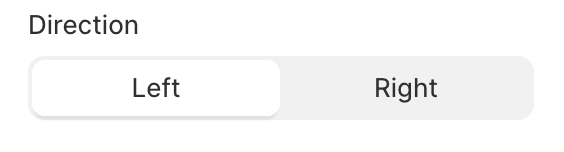
* **Direction:** The way the messages move: Left / Right.
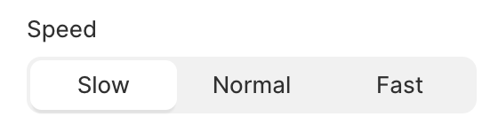
* **Speed:** How fast the messages scroll: Slow / Normal / Fast.
* **Color scheme:** The background and text colors of the whole scrolling bar. While the bar scrolls, this replaces each announcement's own **Color scheme**.
{% hint style="info" %}
The scrolling pauses when a visitor hovers over the bar, so they can read or click a message.
{% endhint %}
### 3. Block settings
**Announcement block**
You can add up to 12 announcements.
* **Text:** The message. Keep it short so it reads well on mobile.
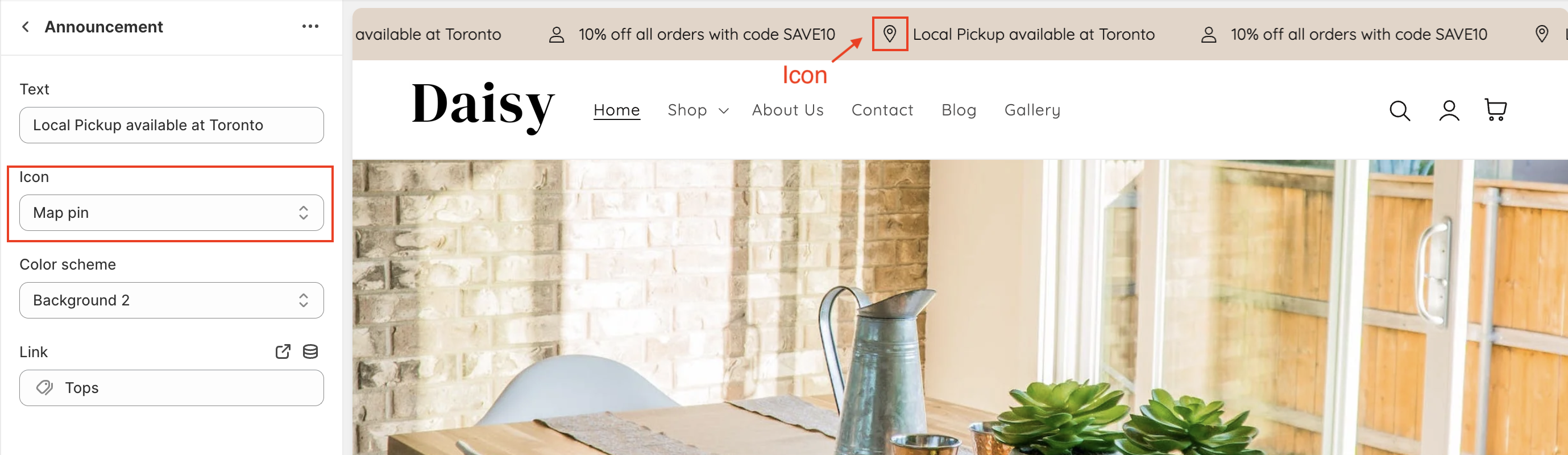
* **Icon:** An optional icon shown before the text. Choose None to hide it. Available icons: Box, Certificate, Chat bubble, Check mark, Clipboard, Credit card, Eye, Globe, Heart, Lightning bolt, Lock, Mail, Map pin, Percent, Phone, Plane, Price tag, Question mark, Recycle, Return, Ruler, Shopping bag, Smile, Snowflake, Star, Store, Sun, Timer, Truck and User.
* **Link:** Makes the announcement clickable. Link it to a page, collection, product or external URL. Leave it empty for a plain message. On a single, static announcement, a small arrow appears after linked text.
* **Color scheme:** The background and text colors of this announcement. It's used when the bar has only one announcement. With two or more, the section's **Color scheme** is used instead.
### 4. Other sections for the Header area
Besides the Announcement bar, you can add these sections to the **Header** area with **Add section**:
* [**Toolbar**](https://help.inspiredtheme.com/articles/header/toolbar.md)**:** A thin bar with one message and link, plus optional social media icons and country and language selectors.
* [**Countdown timer**](https://help.inspiredtheme.com/articles/header/countdown-timer.md) (🔒 Pro): A bar with a short message, a live countdown to an expiration date and an optional link. It can hide itself when the countdown ends. It requires a Pro or Max License key. [Learn about plans and License keys](https://help.inspiredtheme.com/articles/general-information/license-key-and-plans.md)
### 5. Tips
* Two or three short messages scroll best. Very long text takes a while to pass by.
* Use an icon that matches the message, such as Truck for shipping or Percent for a discount.
* Pick a **Color scheme** that stands out from your header so the bar is noticed.