> For the complete documentation index, see [llms.txt](https://help.inspiredtheme.com/articles/llms.txt). Markdown versions of documentation pages are available by appending `.md` to page URLs; this page is available as [Markdown](https://help.inspiredtheme.com/articles/product-pages/product-information-section-settings.md).
# Product information section settings
Choose how product images and videos are laid out on desktop and mobile: slider, stacked or mosaic, media size, zoom, image ratio and corner radius.
***
The **Product information** section settings control the layout of your product media: images, videos and 3D models. The product details on the right (title, price, buttons and so on) are set up with blocks. See [Product information](https://help.inspiredtheme.com/articles/product-pages/product-information.md) and [Default product blocks](https://help.inspiredtheme.com/articles/product-pages/product-information/default-product-blocks.md).
### 1. Open the section settings
{% hint style="info" %}
**Steps:**
* In the theme editor, open a product page using the page selector at the top.
* Click the **Product information** section in the sidebar.
* Change the settings below.
* Click **Save.**
{% endhint %}
### 2. Sticky content
* **Enable sticky content on desktop:** The product details stay in view while shoppers scroll through your media, so the **Add to cart** button is always within reach. The sticky effect ends once shoppers scroll past the last image.
### 3. Media
* **Desktop layout:** How product media is shown on desktop.
{% tabs %}
{% tab title="Slider" %}
One large image at a time, with navigation to move between them.
* **Slider navigation:**
* **Thumbnails left:** Small clickable images to the left of the main image.
* **Thumbnails bottom:** Small clickable images below the main image.
* **Counter:** No thumbnails; an image counter such as 1 / 5 shows where shoppers are.
{% endtab %}
{% tab title="Stacked" %}
All media is shown one after another down the page. Works well with **Enable sticky content on desktop**.
* **Show thumbnails:** Adds small clickable images to the left of the media.
{% endtab %}
{% tab title="Mosaic" %}
Media is shown in a grid of large and small images.
* **Mosaic pattern:**
* **First image full width:** The first image spans the full width, followed by images in pairs.
* **Alternate full width and pairs:** Full-width images and pairs alternate down the page.
{% endtab %}
{% endtabs %}
* **Desktop media size:** How much of the page width the media takes, 30–70%. The product details take the rest. Media is sized automatically on mobile.
* **Image ratio:** Adapt to image / Square / Portrait / Landscape. **Adapt to image** keeps each image's original shape; the other options crop all media to the same shape.
* **Show border:** A thin border around each image.
* **Enable image zoom:** Shoppers can click an image to open it full screen in a lightbox, where they can zoom and move between images.
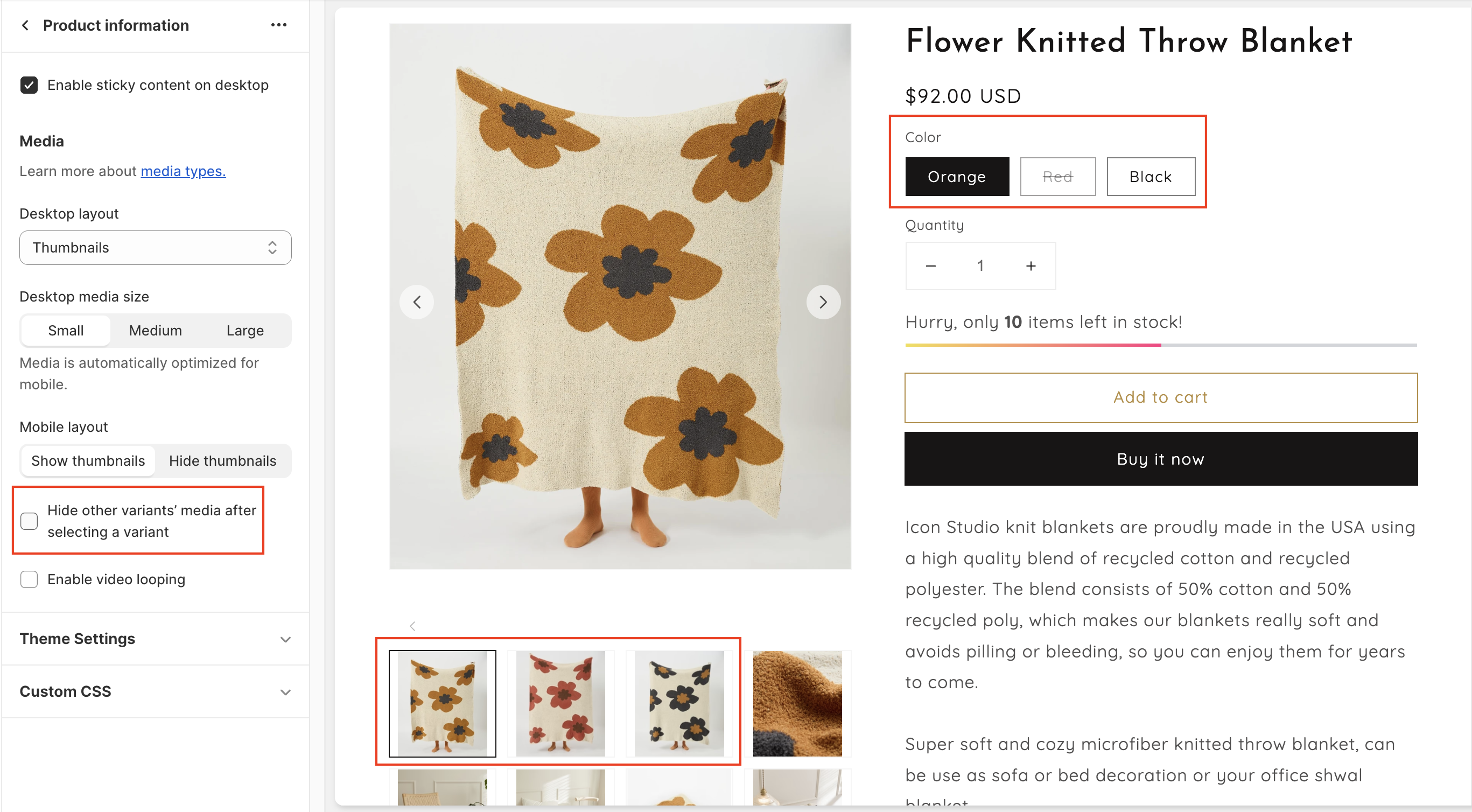
* **Hide other variants' media after selecting a variant:** Only shows the media assigned to the selected variant.
{% tabs %}
{% tab title="Off" %}
{% endtab %}
{% tab title="On" %}
{% endtab %}
{% endtabs %}
* **Enable video looping:** Product videos restart automatically when they finish. When off, they play once.
### 4. Mobile layout
* **Mobile layout:** Show thumbnails / Hide thumbnails below the main image.
* **Mobile media layout:**
* **Full width:** Media runs edge to edge, with no page margins.
* **One column:** One image per view, inside the page margins.
* **Custom width:** Each image takes part of the screen width, so the next one peeks in from the side. Products with only one image use **One column**.
* **Mobile media width:** The width of each image with **Custom width**, 60–95%.
### 5. Corner radius
* **Featured media:** Rounds the corners of the main media, 0–40px.
* **Thumbnails:** Rounds the corners of thumbnails, 0–20px.
### 6. Tips
* To use **Hide other variants' media after selecting a variant**, assign an image to each variant in **Shopify admin > Products**. Media that isn't assigned to a variant is always shown.
* **Stacked** or **Mosaic** with **Enable sticky content on desktop** works well for products with many images, such as apparel.
* Use **Custom width** on mobile to hint that there are more images to swipe through.